
Backlinks Fast? Your comments on the html version of my “Backlinks Fast” edition of Marlon’s Marketing Minute. Let me hear if YOU like this format!
|
|
5/8/2010 — 9:25 a.m.
Overview of this week's issueHello, Marlon here.
This week's article:
Who needs links to your websites or blogs, what will they do for you, should you get them and will they make you more sales and when?
Check this out. It's a blog I put up last week and it's ranked on page 2 under a competitive keyword but it has NO CONTENT at all yet:
 Read today's article for more details.
At the bottom of this issue is a special message from S. Mouse. You'll want to be sure to read it.
Let me know if you like this html issue or not.
Best wishes,
Marlon
PS: If you need support of any kind do NOT email. Go to: http://www.getyoursupport.com
|

|
Grab Backlinks Jackpot this weekend only for a BIG discount and discover all the basics of seo in only a few hours!
time_stamp
You might think it's weird I'm talking about freaking Google and seo. You and I both know that the best traffic hands down comes from your affiliate program. However, since my old pal Terry Dean is now getting the bulk of his traffic from seo, he's convinced me that if you're willing to attack it for six months, it's a big source of traffic.
 Finding GOOD, down-to-earth info on seo is harder than chomping on nails. In doing massive, intense research for my new, upcoming Traffic Dashboard, I ran across this little gem of a product and bought resale rights to it: Special price ends Sunday night
By the end of the weekend, you can have a practical seo plan that works. But be sure to read today's article for insights and nuances.
|
|
Who Needs Links To Your Websites or Blogs, What Will They Do For You, Should You Get Them, How Do Get Them and Will They Make You Sales and When?
time_stamp
1. What are backlinks? Backlinks are simply links to your web page, blog, Hub Page, Squidoo lens or whatever other page you're trying to get ranked in the search engines.
2. Are they important? Google ranks sites largely based on the flow of trust created by backlinks. A NEW development is that Facebook is trying to circumvent the ranking of the web with their brand new “like” button. This is a threat to Google's long term success. But it's in very early stages. For now, having content on your web site and links to it is how you get ranked. If you've missed my last few issues, go to marlonsnews.com and read them. I've really covered a lot of great info on seo and backlinks.
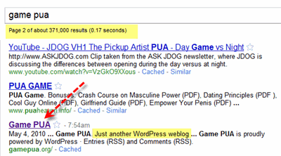
3. Does “backlinking” really freaking work? Is it worth the trouble? Here's the thing: Getting ranked in Google is basically a competition among other web sites that also want to be on that first page for the keyword term. There are several methods of competition: a. Identify keywords with decent searches but very low competition. A very quick gauge of competition is typing your phrase in Google in quotes like this: “most handsome guy in the world”. A better method is the “in anchor” method but for right now I'll just teach you the quoted results method. You'll get something like 20,000 results. I'm on some weird Google beta search results thing (probably from doing TOO many searches doing research for Traffic Dashboard). So you may get a different number. In any event, what that means is 20,000 pages or however many you see have this exact term on them: most handsome guy in the world. It does NOT mean people search in quotes. That's a total misunderstanding. Now, you type in Google: mosthandsomeguyintheworld.com you'll see that my Facebook comes up. Because I really AM the most handsome guy in the world. Google just doesn't think so….. YET! Gary Halbert USED to be the most handsome guy in the world… at least in his own mind. So now I am. 🙂 The problem with identifying keywords with low competition is it's time consuming. That's why you want to use: Keyword Research Tool I Recommend I JUST did a webinar with James last week on this tool that is almost all content and killer: I highly recommend watching it. That would be an affiliate link for MicroNiche Finder that boils it all down to little green dots. Just look for the green dots and you got yourself decent keywords. b. Outsmarting the other guy or gal There are many shades of this. But it basically comes down to being better informed about seo methods than the next person, which comes down to reading and watching videos, buying courses and doing your research. c. Being better at outsourcing If you're better at outsourcing than others, you'll win the Game over time. It's no secret that John's course on outsourcing rocks at: http://www.outsourceplan.com d. Consistency This is mostly the Terry Dean method. Terry pumps out 3 articles a week like clockwork and puts them on his blog. Over a period of six months IF you do good keyword research, get backlinks and have your blog set up right, that works. 4. How fast are the results? You CAN get ranked really fast for keywords. But probably for very low competition keywords. But if you specialize and get good you can do better. The most productive way to look at this is as a Game you play on your blog or blogs over six months or a year, although you should be seeing results and getting some rankings as you go along. But check this out. I put up this blog LAST WEEK and it has NO content yet:
I haven't even done a linking campaign to it yet. You'll notice there are 371,00 broad competitors in Google.
There are 31,100 inbound anchor text links using this phrase and 34,200 quoted results!
If you go to http://www.gamepua.org you'll see it's the DEFAULT blog. No articles or content at all.
Wanna know how I got this blog to rank SO darned fast without even any CONTENT on the blog? Hey, I'm going to reveal all in the upcoming Traffic Dashboard.
5. Why am I talking about seo and what's my take on it? I HATE things that aren't evergreen. I hate trading time for dollars. But here's the thing: a. You're probably going to have a blog ANYWAY. Why not do proper seo on it since you have one or more anyway. b. Why not put articles on your blog? If you read my Ockham's Razor ebook, you KNOW the role an ezine plays or can play. Or the role that sending content to your list plays. Why not take that content, do seo on it and put it on your blog? The other thing you'll need to do are some article directory submissions, and other things to develop backlinks. Unfortunately, no matter how great your content, those backlinks won't happen by themselves for the most part. But you can have articles written for $4 to $6 each. And you can participate in blog carnivals and do other things to get links to your blog or blogs. Now,, I do NOT believe in building your whole business model around Google. One change in how they rank sites can cause you to NOT pay your mortgage! That's called being a street person WAY too fast, unless you were smart enough to listen to me and build a list along the way. Your list IS your life saver, your lifeblood, your parachute, your engine. I said it in AmazingFormula back in 1999 or whatever the date was: The Money Is In The List.
The thing I HATE about seo is it's complex to figure out. Once you figure it out, it's not THAT complex. But at first it's daunting. That's why in Traffic Dashboard, I'm going to do my best to eliminate about a year of the learning curve from hades. In the big picture, if you can set up your blog right and get the content onto it you're sending to your list anyway, seo becomes integrated into your business without a huge hassle or ordeal. And it becomes another traffic leg that over time can add up and be a very important part of your business. If you focus on content which in my model you do, and if you use whitehat linking methods, you'll build up something that has a good chance of lasting a long time.
Best wishes,
Marlon Sanders
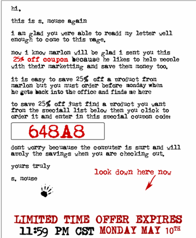
SPECIAL offer from S. Mouse gives you savings on many of my products until Monday:
|

I prefer non html email! Linkbuilding is a must now everyone seems to be competing with every site in the world. everyone seems to be chasing the buck at the moment
Marlon,
I got the new HTML email and thought it looked great. Obviously I am in the minority. I just want to keep getting your great info. So please the crowd and keep the good stuff coming and if text is preferred so be it.
Hey Marlon,
Great article. Link building should be on everyones agenda for their blog. If you can get the links coming in from other people who visit your blog then you are on fire.
Backlinks Jackpot looks excellent.
Glyn
Hey Marlon…
The HTML edition arrived but is hard to read.
You might try a link to an actual webpage in your email…In This Weeks Issue, etc
Regards
Paul Gallion
Viral Marketing Strategies
Received HTML edition, and it's really hard to read, gray on gray on gray, you have to force yourself to concentrate. Plus all the gray is a downer. Another comment on the product in the newsletter and various recent products and recommendations — all are video courses and I DO NOT DO VIDEO. Give me a readable option and I'd love to buy, but not videos. They are huge time wasters.
P.S. I disagree with David … if there is any repetition then chances are it needed to be repeated (ie. it's important) and secondly … it can take a while for a new concept to sink it. We're all at different stages in our 'journey'.
And not every email can be amazing or profound and again … it depends on what stage of your journey you're at.
I like 'em and make sure to read them when I've got time to dedicate to them (not just a quick skim and delete).
Looks ok … and I don' think it's any harder than scrolling through your old emails in a .txt like format. Quite like the highlight … that definately gives some clarity and draws the eye much better.
SEO and backlink building is probably my most hated job … partially because you don't see the return for a little bit. Have been experimenting with link wheels recently which bumped my site 3 places upward on page 1 of Google.
It arrived in my mailbox and I like the text format much better. Very unpleasant to the eyes.
Actuall I preferred it to the regular text based ezine… I would suggest making the text black to make it a bit easier to read though.
Cheers,
Dave.
As usual your content is superb! But the format was way too hard to read.
Great information as usual, but I have to agree – I prefer the text format for easier reading.
Junk it and rework.
How about this?
Stay with text.
Dear Marlon,
I think there is something behind this "test"!
You know that there's something wrong.
You've always liked the simple yet Rich content.
Tweaking is a good step, but for better.
My best Regard's
Paul Nawfal
Marlon,
I love your products, information and dedication but, I didn't like your new format. My vote is that you go back to your previous format.
I did purchase two products from this email – even if I didn't like the way it looked. The results of your linking campaign was very impressive.
Change the font Marlon to one without serifs. This makes it easier to read, plus don't be scared of a 12point size. Makes it easy to read too.
Marlon I love your stuff man it's always TOP NOTCH SHELF INFO.
Your Friend
Frank Gorka
PS: Marlon can you call me please VERY VERY IMPORTANT — HOT HOT NEWS THAT I ONLY WANT TO SHARE WITH YOU MARLON, BECAUSE OF ALL THE TIMES YOU HAVE HELP ME IN THE PAST
423-yyy-xxx Your Friend Frank
Content is always great. The layout of the page has a dark gray column to the right where words get lost and can't be read.
P.S. Just to be fair, I really do enjoy your work and your regular updates. I have been following your work ever since I was in the Texas Hill Country and when you were originally down in Bandera, Texas. (I lived in Blanco, by the way.)
Now, I'm living just outside Lubbock, but plan on coming back down there soon. I will probably come through College Station and drop by the office to visit.
I used to work for Borden Ice Cream many years ago and Gerlands and Brookshire Bros. groceries were on my route. I really liked College Station and Texas A&M. Fine town and great school!
Marlon, the font is really a killer on the eyes. I won't even scan it to try and read it. You're REALLY going to lose a lot of readers if you keep this up, buddy! 🙂
HTML version arrived with no problem, but I have to agree with the majority when it comes to the formatting – particularly didn't like the grey font colour. May be an issue with some email clients, but I didn't find the text to be crowding the borders at all (using Outlook Express).
Perhaps a TOC linking to individual articles within the email would allow people to jump directly to the part that is of primary interest for them.
Bill
Cracking content Marlon.
But REALLY hard to read.
However … I should not be too hasty in trashing it. Sometimes the weirdness a format like this can have an attention grabbing effect. (Seriously)
One BIG change you can make that will improve it drastically is to move the typesetting away from the borders a bit.
Jonathan
Pretty much agree w/all those who said "Great Content" lousy design…
But considering You it was probably intentional. Anyway thanks for your word
s and idea sharing.
I agree with many of your other fans. Great content, hard to read. I have great vision and the font is difficult, the layout too tight and overall, it doesn't catch my eye at all. If it were anyone else, I'd click away.
Take care,
Tom Justin
Marlon Rock solid as always I received mine in text form very good info just seemed a little tight in that format.
I know this was one of your test to see if your readers where paying attention is that it Marlon?
Marlon I have created a 7 day free trial for my new software would you please review it? http://www.twittermanagerpro.com
Hi Marlon,
Yes the news letter arrived.
I got the text version.
The print was very small and hard to read.
Not enough white space.
Great content though.
Hi, Marlon,
The content is great, as usual. The format, not so much. I'm not a fan of fancy HTML email to begin with, but this was way over the top. As others have said, it is very difficult to read and I have a 21" monitor!
I prefer to use HTML sparingly so that I can embed graphics like the charts you showed, and to show real links instead of AWeber's ugly tracking links, but beyond that, it's so much wasted bandwidth. I suggest you lose the paper background and use a larger, clearer font.
Thanks for asking, and thanks for the continual great content.
What up Marlon!
Kinda dug the previous e-zine version more.
It could have been the gmail, but the newsletter did not seem as fluid, maybe a little choppy.
But anyway, what truly matters is content, and again you delivered. Thanks!
– Luis
There's the word "time_stamp" in the newsletter and the background of the template seems to be double-lapping. There's also the "t," at the header which I do not understand the use of it.
The content is definitely good but the design affects the readability.
Hi Marlon,
Love the new email format, but have to agree that the new font on the blog is not so easy on the peepers.
Not a fan of this format at all.
Hey Marlon!
You always have great content, and you always make it as unappealing as possible. Not a big fan of the colors. Definitely need space around the edges.
It doesn't need to eye-popping. Just clean and easy to navigate.
But more important, and I've always felt this, you just cram too much into these newsletters. It's a chore to sort through them. 50% of the time, I open them, take one look, and delete it because I just don't want to spend all the time it requires to navigate down what seems like a never ending page.
There's too much to sort through and much of it is repetitive from issue to issue, sometimes even in the same issue.
If they were 50% shorter, it would be a huge improvement.
Hope this helps a bit.
Dave
The left column prints crowded to the edges and the headline " Marlon’s Marketing Minute" is not well centered in the maroon bar. The right column goes off my monitor and there is no way I can read it to the edge.
Content great – just what I expect from your blog. I will be back!
Well Marlon, it's definitely different. The content is gold, as usual, but I'm not too crazy about the format. It looks a bit busy, but I admire your creativity.
It took me 2 seconds to decide NOT to read it. The font is too little (on my Firefox and Mac) and too close to the border of the boxes. General comment: "unreadable".
Give us back the text version (or find a more readable HTML format). Thumb down.
Sorry for the duplicate, I just thought a photo would be nice to include.
Space on the left and right margins for easier reading. The text on a red background is nearly impossible to read.
I agree with Stephanie and Rikke. The images are nice and the content is good, but it's so hard to read, especially for us older Internet Marketers who are just starting out. It was a little too easy to zone out, perhaps a larger font and in black, and no so much looking like it was composed on a typewriter. Otherwise, great.
Marlon,
I like it but it seems you have crammed everything. Too much info ( I don't believe I wrote that lol)
John
It was kind of strange to see it after all this years of plain text lol. I like images and I will get use to it.It gives you more options to tell use something.Images,tables,…I think less people will come to your blog if you leave it that way.My main reason was to come and comment and also to see it in html.I will always read your emails because content is always great.
You go 'girl'!
Hi Marlon – I do receive and read your newsletters – They are consistently jam packed with great information – Lots of quality content. Now in the new html format it takes a lot of effort to read.
I can't scan the content as easily for those things that interest me and found myself wanting to just delete.
Having the pics in to illustrate a point is good. I like the visuals. Yet I have to agree with Stephanie and Rikke the typeface is difficult to read and the spacing feels too packed tight. Margins will help and better distinction for the topic headings – perhaps BOLD CAPS!
Thanks for all the tips & help you provide.
Terry
http://terryloving.com
Hey Marlon!
1. Did it arrive in your email box?
Yes.
2. Did it look correct and good or messed up?
The red mast-head had a link and the 'anchor text' was just "t, ". Was that intentional.
The formatting was slightly messed up. The top image of each section looked like it was there twice. And, the bottom image looked like it has some extra stuff that wasn't supposed to be there.
There was some text "time_stamp" above the "Hello" that I'm guessing should be replaced by a time stamp, but wasn't.
3. Did you get the text or the html version?
HTML
4. What did you think of it?
The content was great, as usual.
The gray text on the gray background was pretty hard to read.
The mast head (the big red bar and plain text) looks a little plain. I think it should be something that highlights your outrageous style.
Hey Marlon…I was not happy with the html version…actually…it was indeed very hard to read…and the type was to light in color. Otherwise…the content was extraordinaire…many valuable lessons to be learned my friend.
Thanks again…for the straight talk.
Glenn
Marlon;
I don't care for the HTML emails. They require extra clicks when I view them and I can't see them on my Blackberry. I delete html emails that I receive on my Blackberry and that makes them look Read when I open my email so they don't work for me. I hates them, I do.
Did it arrive in your email box? Yes
Did it look correct and good or messed up? Excellent
Did you get the text or the html version?
html Version
What did you think of it?
Excellent viewable
Marlon.
First: I read all of your emails. I get so bogged down with so much email, I am very selective with the ones I read.
Yours always contain useful information. Always! And I will continue to read your email no matter what.
However, I did not like the HTML format.
For my email program, it was a little difficult to read.
Given the choice, I would choose text only. So my vote is that you go back to your previous format. Whatever you decide, your emails will always be read by me.
Keep u the good work my firend.
albert grande
Hi Marlon,
I liked your HTML version of the newsletter, and love the killer info on backlinking!
I know the backlinking works , as Last year I published one of your articles "Get Ranked on Google in 37 minutes!" and you kindly linked to my website thanking me!
Well in the last week I have found that the Newsletter signup , I have on that blog , is starting to convert! A number of people have been coming to my blog and signing up to the newsletter through that page!!
So thanks for firstly writing the killer info in the first place , and thanks again , for linking to my website!
Steve Cotterell
http://www.ecommerce.fm
Marlon,
O like the blog, the grey background needs to turn white (Maybe S Mouse could do) content is super. Maybe you cou;ld find an instruction on start from scratch website construction or such. for us newbie types. Overall though….GREAT.
Since you asked I thought it was horrible and not only hard to read but looked unprofessional and not the typical product from Marlon Sanders. I love your stuff but would never have said that had you not asked. I would not read this ezine again, however, in this html format and I really look forward to getting your info
Terrie
I like it Marlon. You can put up screen shots and pics. It's cool. Different.
And thanks for the great information. Keep it coming.
Steve
Marlon,
Is this just a test? I have followed you for years and this just does not look like your work. The info is as good as it always has been, BUT the layout needs alot of work!(If you need help, let me know).
Your Marketing Friend,
Arnold R Moore jr
I think it looks good, only problem I see is the text in your long article on backlinks is squeezed in at the margins. That just doesn't look right!
Was a bit hard to read definitely needs a new font and maybe a touch bigger.
Look's okay but i still prefer the Text Version.
Hi – I found the format extremely difficult to read – not enough white space on the sides and the font was hard to read too.
I think I prefer plain text to html emails in general – especially if it feels like a long sales page…
Content was fabulous – as usual!
every time an improvement on top of perfection .Thanks keep em coming!
The article is educative as far as I am cocerned.I am bookmarking the same in order that I may read the article sdveral times as it may help me in article writing and marketing business.
Personally I prefer the HTML format and I think you've done a good job with it!
~Karen
Hey Marlon…content spot on, per usual. But I must say this format was a little harder on the eyes. If I could make one suggestion – could you make the typeface black instead of grey? It would sure improve readability! Thanks!
Hi Marlon,
My honest opinion? It's too hard to read. You need another font – one that is optimized to webreading (a sans serif font) – and some space at the left and right margins.
Best regards
Rikke
Looks good Marlon, good info too.