Marlon's
Marketing Minute
Vol. 5, #22, May 22, 2010
Overview of This Week's Issue:
—
A. Sponsor advertisement
— B. Announcements from Marlon
— C. Main Article: How to Turn Your Niche Idea Into A Full-Blown Business, including a complete real example
— D. Resources
Hello,
Marlon
here.
This
week's article: “How to Turn Your Niche Idea Into A Full-Blown Business — including a complete, illustrated real example”
Today I'm going to show you a great example of creating a niche product for a market. Last issue I talked about emofree.com and how Gary Craig simply adapted the work of Dr. Roger Callahan. Now, today I look at how another marketer took Gary Craig's idea and built a DVD and big affiliate promotion around it. Here's the site:
Read
today's article for more details. Then re-read it just to be sure you
didn't miss anything, a'ight?
Let
me know if you like this HTML issue or not. It's a masterpiece HTML
template so of course it's bound to be good… but just in case you
don't like it, I wanna know!
Best
Wishes,
Marlon Sanders
P.S. You can put your P.S. text here…
and if you want you can include a P.P.S. too and a P.P.P.S. and so on
and so on and so on.
A. Sponsor Advertisement
Discover the 6 figure secrets of the amazing Affiliate Cowboy and start earning on Monday!
6 Figure Secrets Of The Affiliate Cowboy
The price is this weekend ONLY. I've been doing a few of these weekend specials and you guys and gals seem to be loving the great bargains.
=============================
B. Announcements from Marlon
=============================
1. Do NOT email us for customer support
Do NOT email us for customer support. We are anxious to
serve you at: http://www.getyoursupport.com
Get Customer Support Here
We have LIVE CHAT to serve you better. Most people in this
business skimp on this. I don't. Tim is an award winning
customer service person.
2. Did you buy Big Course or Cash Like Clockwork?
These products are ONLY digitally delivered. Tim says I need
to make sure you know this. The tabbed interface to access the
products is quite elegant if you ask me and the ultimate in
convenience.
3. Quick Start For Writer's Secret Implementation Videos
available for purchase SEPARATE from “The Writer's Secret”
Lisa put sweat, blood and tears into covering all the crucial
details in these videos. You can see the videos at:
http://www.quickiestart.com
4. Ateam webinars
Good things are coming. I've just been bogged down in this
darned Traffic Dashboard which is taking forever to research
and complete. But it'll be 100% worth it for you.
^^^^^^^^^^^^^^^^^^^^^^^^^^^^^^^^^^^^^^
C. Main Article: How Gary Went From $18,000 a
Year To $400,000 a Year
^^^^^^^^^^^^^^^^^^^^^^^^^^^^^^^^^^^^^^
If you've read my past articles, you've used MicroNiche Finder (aff link) to find a lucrative niche market. You should be locked, loaded and ready to rock and roll. If you aren't, you need to go back and read my back issues.
Now, let's look at how you flesh out a whole marketing sequence in a niche market. The example I'm using is a product I love called The Tapping Solution. This is NOT my product. I bought the DVD because Joe Vitale is on it and told me about it.
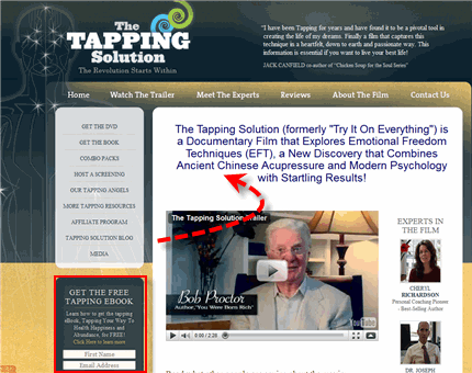
First, let's look at the MAIN web site. Keep in mind…this could be YOUR web site. And it could be about dog training, Salsa Dance, or how to do WHATEVER…
This is the main site:

Notice the opt in box I've highlighted in red where people can input their name and email address to get a tapping ebook. Notice the headline and the testimonials on the right as well as the main video and testimonial from none other than Bob Proctor.
Landing Bob Procter as a lead testimonial was a great idea.
By the way, I bought this DVD and loved it. It's what turned me onto this whole tapping thing. Then, I bought Gary Craig's dvd's off ebay since he doesn't sell them any longer. I found out you can tap for ALLERGIES or things you sometimes have a reaction to.
Anyway, you can hire a graphic designer to create a page with similar quality as this for $150 to $250 or $500. There's a very big difference in what designers charge. The point is, if you're on a budget and you shop around, you can literally get a very nice design for $150.
My friend Adeel Chowdhry (he did one of my video bonuses for Promo Dashboard) has multiple products that have hit #1 in very competitive categories on Clickbank. He has top notch graphic design and pays probably $250, if that (or did in the past).
Now, there are a few things about the above site I'd split test. Normally, the more links and choices you give people, the lower the response. I'd test this design vs. a one-action design.
But I LOVE the way the testimonials go down the side.
Now, scroll all the way to the bottom and you'll see an affiliate sign up link at the bottom. They uses 1 shopping cart for their affiliate program. Here's my private label of it if you'd like to try a 30-day trial.
After you sign up, that's the page you go to with affiliate links. Notice the nice branding at the top.
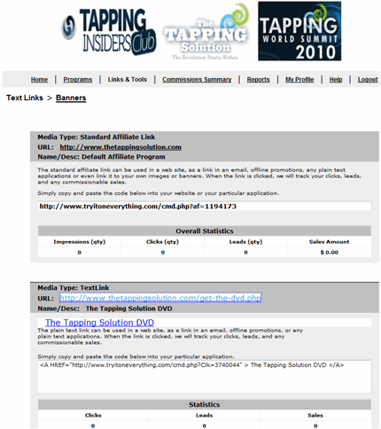
You'll notice they built a WHOLE business around this:
1. Tapping Insiders which is a continuity program.
2. The Tapping Solution DVD which is the front end
3. Tapping World Summit which is their seminar
That is a very well-constructed back end. You can't complain about a DVD front-end with super power testimonials including Joe Vitale and Bob Procter WITH a monthly membership site on the back end AND a seminar.
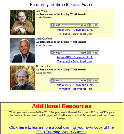
Here's something NEAT they did. I got an email offering me a freebie preview of the World Summit Event (which is sold for digital access now).
I got to listen to Joe Vitale's speech on Tapping AND Jack Canfield and Bruce Lipton. And you can too. Tapping World Summit Preview.
I read that over 81,000 people attended the first Tapping World Summit! That's a lot of people.
You wonder HOW this whole process is going? Check out the Alexa:
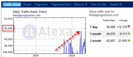
That's an outstanding spike on Alexa and indicative of a pretty strong product launch.
Speaking of the product launch, they DID also have a JV page. I saw it earlier but I'm running out of time to get this ezine issue out.
I hope you enjoyed this. I doubt I'll be able to do this each week because it takes quite a bit of extra time to do an html version. But I hope I've opened your eyes on the steps to fleshing out a niche and turning it into a business.
Best wishes,
Marlon Sanders
Marlon Sanders is the author of “The Amazing Formula That
Sells Products Like Crazy and the KING of Step-By-Step
Internet Marketing.”
To get on his killer ezine list, to get cheat sheets and all kinds
of other goodies every Saturday and during the week, to get simple,
to-the-point Internet marketing know that works real world without
all the hype, go to: https://www.marlonsnews.com and subscribe
Check out all my products here:
http://www.getyourprofits.com
(SIGN UP AS A RESELLER, put YOUR reseller URL and ID where
the above link is, post this on your web site and make some
dough for spreading a killer guide everyone will want to
read.)
//////////////////////
REPRINT RIGHTS: You have permission to use the above
article without omission and including the resource box.
You have the right to insert your reseller URL for any
products I mention
=========================
D. Resources you can use
=========================
(If you want to post this ENTIRE ezine, you can replace the
following links with your RESELLER links. Get your links
at http://www.getyourprofits.com)
1. After 8 years, thousands of customer emails, thousands of
buyers in virtually every major city in the world (and
many you haven't heard of), 13 web site designs, 4 product
designs, after ebook and CD versions, after endorsements
from major marketers the world over, after hundreds of
marketers and products have come and gone, after attacks
by the world's most notorious criminals, after attempts to
put it under, there is ONE product that remains and stands
tall. There is one product that is stable.
Internet Marketing Ebook
2. Newbie Fast Start Help Kit
The Marketing Diary: Me teaching Matt daily all the
details of the Amazing Formula and Gimme system. This
contains additional insights into The Amazing Formula and
Gimme that you won't find in those products. It's
literally what I taught to Matt in his first 90 days with
me. Internet Marketing For Newbies
3. The A to Z of Designing & Building Your Web Site
Design Dashboard shows you not only the basics of doing your own design but really walks you step by step through setting up your hosting, autoresponders and shopping cart.
Web Site Design Training
This is an EVERGREEN product and if you're new to this business
you'll learn tons..
4. Promote your own products made easy
Grab the brilliant video by Adeel Chowdhry on how to mash
together stock video, stock sounds and stock music to create
an attention-grabbing, compelling video you can put on your
sales page, Facebook, Squidoo lenses, Hub Pages, or even
Twitter out to your list.
Promote products online
6. Your Own Products?
It's the only step-by-step, A to Z system not JUST for
creating info products …. but that shows you HOW to select
product ideas using my “flanking move” I've built my business
on, HOW to do 12-product surveys with an actual example, that
gives you a tested, proven email & source with a 30% success
rate in getting interviews with experts — PLUS, templates
that would cost your more than the Dashboard to have custom
created! Create info products
+++++++++++++++++++++++++++++++++++
E. Get the Evergreen Traffic System
+++++++++++++++++++++++++++++++++++
Tinu emailed and says she has added new info on social media!
Most All Her Domains Got Shut Down, She Can't Get Out Of Bed Some
Days, Her Hands Swell Up Like Balloons, Her Podcast and Video
Hosting Got Shut Down — And She STILL Snagged 3,579 Average
Visits Per Day In April 2008!
Evergreen Trafffic System
Evergreen Traffic System is now sold and serviced directly by Tinu.
That link there would be a tracking link and NOT an affiliate link.
Tinu's seo stuff is BRILLIANT and evergreen. It STILL works
awesome.
==============================
May the road rise up to meet you
and the wind be always at your back
and until we meet again
may God hold you softly
in the palm of his hand
— Irish poem
Copyright 2010 Higher Response Marketing Inc.
All rights reserved.
|
Yeah, This week's html version is better than the previous html, Now it looks great, The text is easy to understand and the contents are well defined.
The text is in bold (Arial, while in the blog is Georgia or other serif font) even in my GMAIL email client. And the text is centered in the first part, till the end of the P.S.
[Marco, that is SO strange. I use gmail and it looks perfect. Hmmmm. Who knows?]
This week's HTML version is way better than last week's version, and I like the look and feel. But I also like reading your text-only messages, I'm interested in your great content, not in pictures. And don't some email services block HTML? How about using text most of the time and throwing in a special HTML message every now and then?
This weeks version is much better than last weeks edition. I read the newsletter without the images and clicked on the links to see what you were talking about. Then after reading your last email I realized that the images weren't displayed in my copy of the newsletter – I turned on the images on.
I prefer the text version, that you sent out before you started changing the format. May I ask why you wanted to change?
[Hi Lani, I want to be able to display images. And I think that the text may be more readable. If you click "always display images" on my email, if I continue
sending them this way, they'll always show.]
Marlon,
I understand why you would use html to show pics, but personally, I prefer the text version. You write great texts, and I get way more from your texts than from pics + text.
Just my very personal opinion, though.
Enjoy your weekend! 🙂
Regine
I like the HTML version. It's easier for me to read, and the video was good. I clicked right over there.
Marlon
Hmmmm … your content is ace as always, but, please, bold headings only with regular weight text.
Plus for GOODNESS SAKE make the text flush to the left. Or is it just my browser? Almost impossible to read centered text. Why do you think books, newspapers ansd magazines have it flush left?
Your graphics and pictures are GREAT.
In fact I made whole TV show about the Google SEO power of this:
http://bit.ly/Marlon-Your-Photographs-Rock
Jonathan Gunson
]Jonathan, were you referring to the one in your email? What email reader? Yes, the text IS flush left….in my email reader. If you're referring to the bolded body text that is ONLY on the blog version or should be. It's the weekend and I'm relaxing and didn't feel like trying to figure out how to fix the text issue on the blog. I'll have my filipina fix the blog version tonight. If this is a problem in your EMAIL version, then we have some sort of issue with your email reader and I need to know what you're reading it with.]
Hello Marlon,
Ron Ott here,i really like the HTML version!and it is easier to put in graphics. Go with the HTML Marlon.
Ron Ott
I enjoy reading your email news in plain text. Thank you very much for your concern of your readers. Adriel
Definitely the html version. The text can get hard to follow.
Hi, Marlon,
Huge improvement in this latest version. It looks great. Clean and easy to read (in the email version). HTML does have its advantages, especially, as you said, for pictures. The trick to using it effectively is to keep it simple. If the pictures add to the content, great. If not, text is as good or better. It's all about the content.
Thanks,
John
Thanks for the HTML version. This is much better for the eyes.
But I do have an issue with the HTML formatting of the Newsletter on my yahoo email account – there's no spacing in the paragraphs. So all the text are jumbled up.
Any other people using yahoo email having the same issue?
[Dexter, thanks for bringing this up. I'll check how it appears in my yahoo and if it's a problem look for a solution.]
Hello Marlin,
I vote yes on the new version. It is easier on my eyes, and easier to follow along with the format. Thanks for asking.
As for me, I received the HTML in good order… but I prefer plain text.
As others have said, it is the info that is important.
My personal preference is to read this stuff on a blog with just some teaser text and a link sent via email. My feeling is that having it in my mailbox makes it less valuable.
Expecially the way you write, very personal and conversational, doesn't match with the HTML magazine-like appearance.
I disagree with whom says text is old: text is how friends write to friends, how people send emails. I don't send HTML emails with magazine layout and, in my opinion, you shouldn't do either.
Coming on this specific email, the first part has the text centered from "Hello" to the end of the P.S. Clearly an HTML mistake, but in the start it makes it a bad start.
I love the look of the html message, never really utilized the power of html templates, will need to add that to my to do list, Sally 🙂
[Sally, as you can tell from the comments on the PRIOR html version there's a lot to getting "it right". But your customers will tell you.]
* should have read "30-40"
I liked the email version with the html. Very nice. A pleasure to read.
The ALL BOLD version on the website definitely needs to be fixed.
Keep up the great work!
Best Wishes,
Carl Willoughby
http://www.One-Minute-Cure.com
HTML email format was perfect for me. I've always disliked plain text versions as they are awkward to read unless they are about 3-40 characters wide. But I understand that this is a business and not a beauty contest, so keep testing and measuring what works … and let us know so we can all benefit.
Thanks as always. Andrew
I was immediately impressed with the HTML email which arrived today. It lent itself to a different sort of clarity and I found I read the whole thing. The ability to break up your excellent content visually kept me engaged to read and enjoy it from beginning to end. Also, thanks for the information about the Tapping Method. I spent many hours last week exploring the site and reading the information. Hard to imagine that I could ever say to you that it keeps getting better, because you are "tops", but it's true. The information continues to get better.
Best regards,
Cheryl C. Cigan
[Cheryl, you'll be interested to know I just did tapping on 2 people with back pain today. One was a 7 and one was a 5. BOTH went to 0. One of them had not been able to bend over AT ALL and was able to touch the floor. It only took 2 rounds. I can't explain WHY it works having a psychology background. And there aren't double blind studies supporting it. But I seriously doubt other methods in a double blind study would get THAT result literally in 3 minutes. You couldn't even do that with accupuncture and that requires a trip, appointment and cash.]
This format was much better than the other html format. That being said this worked because you were showing examples and I may just be old and bald but like the plain text best unless there are pictures you want to use to tell your tale.
The tale is the important thing to me and unless there is a need for the examples like you used today would prefer plain text.
[Mike, how are you? Well said my friend. It takes extra time to do the html and I don't know if I'm willing to invest that every Saturday. Having said that, I LIKE being able to show pix of what I'm talking about sometimes. Not always but sometimes.]
Plain Text would suit me just fine Marlon.
And I'm a designer by trade, some pictures here and there are just fine but don't overdo it.
Thanks for letting me voice my thoughts.
Tim
I like it!
You're right, the bold blog version I don't like but the email one is perfect.
It's pleasing to the eye, easy to read and you haven't tried to cram in tons of junk like others do in their html emails. They end up looking like cheap magazines instead of emails with content.
For me the blend is perfect.
Thanks, Marlon.
I like the HTML version. I don't dislike the text version, but I do like the additional images and graphs that were displayed in the HTML version. Good info as usual. Keep bringing us the truth Marlon.
loved the HTML version Marlon …nice clean and easy to read . Great interesting post as well
Hi Marlon
This is a much cleaner version…and the type/font even though it may be bold is easily readable…and I "LUV" it. The only correction that I would advise…is a break (====) in between …Best Wishes, Marlon …and ..the new paragraph …Marlon Sanders is….
Best Wishes,
Marlon
===========
Marlon Sanders is the author….
In MHO…it is far superior to the last html version.
Of course the content is always educational and entertaining. Thanks Marlon for your dedication to your customers and ezine readers.
Glenn
I like the html version – easier to read
I like the HTML better. It looks more up to date and it was easier to find what I wanted to read faster. The images make it look more professional, it helped make this weeks subject easier to get.
I rather enjoy your emails, but for me personally I think emails that are just text are a bit out dated. My email system tends to put hard breaks where they need not be, just making text emails harder to read.
I would give people a choice of either. That would keep both types of readers happy.
Kim Snyder
http://Overallbeauty.com
The HTML is exuding life and excitement.
P.S. I love the Irish Blessing at the end, it is one of my favorites.
P.S.S.
May there always be work for your hands to do
May your purse always hold a coin or two
May the sun always shine upon your window pane
May a rainbow be certain to follow each rain
May the hand of a friend be always near you and
Msy God always fill your heart with gladness to cheer you
Irish Blessing author unknown
[Robert, very nice Irish blessing. I like it.]
Hey Marlon,
I vote for the html version.
Looks great!
Thanks,
Paul Klein
I like this new html version. It is like a magazine.
I'm happy with any format as long as there is copy that's appealing. That said, this makes it a lot easier to read as you can focus on the points you want to focus and browse through the rest.
The web format is definitely a lot more appealing though.
thanks
Hi Marlon,
Very oddly it was the html email I received yesterday that prompted me to buy the product.
I much prefer the html one by far.
I dont know, probably like many people out there, I identify with images and keeps the flow of text interesting as you explain the details.
Thanks
Ps By the way – Your support system is one of the best I have seen so far in the IM niche – Very impressed indeed.
Much better format this week. Easy to read, not intrusive, nice looking. I still think the newsletters are needlessly long, but what do I know? And it is interesting that ugly worked well last week.
Dave
[David, they may be too long. The thing is, people who are hungry and want more will ready every word 3X. It's all about where you are in business and life. For example, I'd be happy if Michael Masterson wrote a book every Saturday in his ezine. Some people you just resonate with.]
That's what I'm talking about. Last week's version was not ready for prime time; it looked like typewritten material on an html background.
You obviously took the feedback you received (not mine since I didn't send any) and turned this into a real nice piece.
It makes is much easier to read.
Hi Marlon,
I like the HTML format, looks great. But of course, I read the plain text version because it's the info that is helpful.
Take care
Rocky
I've seen both, and still prefer plain text. The bold gets a bit hard on the eyes the longer you read, so you start scrolling faster and missing quite a bit of it.
[Dee, read the one in your EMAIL. It's NOT in bold or shouldn't be…I'm too lazy to fix the one on my blog. It's Saturday. But the one in your email isn't in bold.]